Introduction
Most content sites add rich elements (pullquotes, stat callouts, comparison tables) on an ad hoc basis. Different components on different articles, inconsistent spacing, mismatched colours, and zero justification for why a particular block exists on the page. The result is visual noise that hurts readability and erodes trust.
The fix is an opinionated component library with placement rules and justification tests. A system where every block earns its place, every colour choice follows a constraint, and every article follows a profile that determines its visual architecture before a single word is written.
AutomationSwitch runs this system in production: 13 components, 5 content profiles, strict placement rules, and a component builder that turns the same patterns into code anyone can ship. The library also serves as the constraint layer for AI agents: when non-deterministic models enrich articles, the codified component library is the skill that keeps their output consistent and on-brand.
This article shows the full architecture, why each decision was made, how to build your own component creator setup from the same principles, and why a defined component library is the essential first step in any automated content production pipeline.
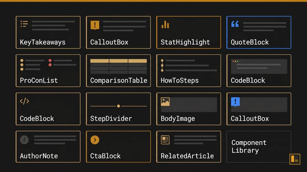
The 13 Components and What Each Does
A component library for editorial content differs from a developer-focused UI kit. Where React libraries like shadcn/ui or Material UI provide interaction primitives (buttons, modals, dropdowns), an editorial component library provides meaning primitives: blocks that carry a specific editorial function within an article.
Each component in the AutomationSwitch library must pass a justification test before it earns a place on any page. Three tests exist:
- Decision Velocity: the component helps the reader decide faster (comparison tables, pro/con lists, how-to steps).
- Monetisation Surface: the component creates a conversion opportunity (CTA blocks, related article links).
- Authority Compounding: the component builds credibility over time (stat highlights, author notes, quote blocks).
The Full Component Set
1. KeyTakeaways
A summary block that appears at the top of every article, immediately after the hero. Five bullet points that give the reader the core argument before they commit to the full read. Justification: Decision Velocity.
2. CalloutBox (4 variants: tip, info, warning, example)
A highlighted block that interrupts the reading flow with a specific type of supporting information. The variant determines the intent: tips offer practical advice, info provides context, warnings flag common mistakes, examples show real implementations. The amber accent signals action variants; the blue accent signals information variants. Justification: Decision Velocity.
3. StatHighlight
A single metric presented with visual emphasis. The number anchors the surrounding paragraph and gives the reader a concrete reference point. Sources are required; unsourced stats are rejected at review. Justification: Authority Compounding.
4. QuoteBlock
A formatted citation from an external authority. The quote must support a specific claim made in the article, and the attribution must include the source and context. Justification: Authority Compounding.
5. ProConList
A structured two-column layout comparing strengths and limitations of a tool, approach, or framework. Each item is one sentence. The list forces clarity because vague pros and cons fail the conciseness test. Justification: Decision Velocity.
6. ComparisonTable
A multi-row, multi-column table comparing tools or approaches across specific criteria. The table structure matches the output of the component builder, which means readers can create their own branded comparison tables using the same design system. Justification: Decision Velocity.
7. HowToSteps
A numbered sequence of actions with brief descriptions. Each step is a single instruction. The component enforces sequential structure that prose paragraphs obscure. Justification: Decision Velocity.
8. CodeBlock
A syntax-highlighted code snippet with an optional language label. Used for configuration examples, API responses, and implementation samples. Justification: Decision Velocity.
9. StepDivider
A visual separator with a label that marks a phase shift within the article. Used sparingly: one or two per article at most, placed where the content transitions from one conceptual phase to another. Justification: Decision Velocity.
10. BodyImage
A captioned image embedded within the article body. Each image must have alt text, a caption, and a defined purpose (proof, diagram, screenshot, or example). Decorative images are excluded. Justification: Authority Compounding.
11. AuthorNote
A first-person aside from the article author. Used to share production experience, acknowledge limitations, or provide context that only the practitioner would know. The note builds E-E-A-T (Experience, Expertise, Authoritativeness, Trustworthiness) signals for search engines and human readers alike. Justification: Authority Compounding.
12. CtaBlock (4 variants: lead-magnet, newsletter, audit, affiliate)
A conversion block with a headline, supporting sentence, and action button. The variant determines the offer type. Each article uses exactly two CtaBlocks: one mid-article (after the core argument) and one at the end. The mid-article placement catches readers who are already convinced; the end placement catches those who read the full piece. Justification: Monetisation Surface.
13. RelatedArticle
A card linking to a related article within the same cluster or pillar. Placed after the conclusion, before the footer. The card includes the article title, excerpt, and estimated read time. Justification: Decision Velocity.
Content Profiles: The Blueprint System
A content profile is a blueprint that determines which components and image slots an article uses based on its editorial purpose. The profile is assigned at scoping time and determines the article's entire visual architecture before writing begins.
AutomationSwitch uses five content profiles:
tool-comparison
For articles comparing two or more tools, platforms, or approaches.
- Required components: ComparisonTable, ProConList, KeyTakeaways, CtaBlock (affiliate or lead-magnet)
- Image slots: hero, prereq_visual (tool logos or setup), evidence_chart (benchmark or pricing comparison)
deep-dive
For articles exploring a single system, architecture, or methodology in depth.
- Required components: KeyTakeaways, StatHighlight, AuthorNote, CtaBlock (lead-magnet)
- Image slots: hero, concept_diagram, evidence_chart, synthesis_visual
workflow-how-to
For step-by-step guides showing how to build or implement something.
- Required components: HowToSteps, CodeBlock (if technical), CalloutBox (tip), CtaBlock (lead-magnet or newsletter)
- Image slots: hero, prereq_visual, milestone_1, milestone_2
strategy-framework
For pillar articles that define a strategic approach and link to supporting content.
- Required components: KeyTakeaways, StatHighlight, QuoteBlock, ComparisonTable, CtaBlock (audit)
- Image slots: hero, concept_diagram, evidence_chart
audit-assessment
For articles that evaluate a specific practice, tool, or workflow against defined criteria.
- Required components: ProConList, StatHighlight, ComparisonTable, CtaBlock (audit)
- Image slots: hero, evidence_chart, synthesis_visual
The profile system prevents ad hoc component selection. A workflow-how-to article always gets HowToSteps and milestone images. A tool-comparison always gets a ComparisonTable and ProConList. The author works within the profile, focusing on the content rather than making layout decisions article by article.
Placement Rules and the Two-Colour Constraint
Mandatory Placement Sequence
Components follow a fixed sequence within every article:
- KeyTakeaways always appears first, immediately after the hero image and before the introduction.
- CtaBlock (mid-article) appears after the core argument section, typically between Sections 2 and 3.
- CtaBlock (end) appears after the conclusion, before RelatedArticle.
- RelatedArticle appears last, after the final CtaBlock.
All other components are placed within sections based on the content profile and editorial judgment. The fixed positions ensure that the reader always knows where to find the summary (top), the primary offer (middle), the secondary offer (bottom), and the next article (footer).
The Two-Colour Rule
The component library uses only two accent colours:
- Amber (#c8861a): action-oriented components. CTA buttons, tip callouts, stat highlights with performance metrics, recommended badges in comparison tables.
- Blue (#3b82f6): information-oriented components. Info callouts, quote blocks, definition boxes, supporting data highlights.
The constraint eliminates the "rainbow problem" that plagues content sites where every component uses a different colour palette. The reader learns the colour language: amber means "do something," blue means "learn something."
The consistency builds a visual language that readers internalise. Every amber element is a prompt to act. Every blue element is a prompt to understand. The articles look like they belong to the same publication because they do.
Why Constraints Improve Output
Design systems literature consistently supports the principle that constraints improve creative output. The Nielsen Norman Group's research on design systems demonstrates that component-based systems improve consistency and reduce decision fatigue across teams. The two-colour rule is the editorial application of this principle: fewer choices for the author means faster decisions, more consistent output, and a stronger brand signal for the reader.
Why AI Agents Need a Codified Component Library
When a human editor works without a component library, the result is inconsistency. When an AI agent works without one, the result is invention.
Large language models are non-deterministic. Even when given clear instructions, they optimise for what they calculate is the best output. An agent asked to "enrich this article with visual components" will select, arrange, and style components based on its own judgment. The agent is well-intended. It genuinely aims for the strongest outcome. The problem is that "best" changes with every generation. The same prompt produces different component selections, different placements, and different visual treatments each time.
The models will always do what they think is optimal. An agent enriching a comparison article might add six callout boxes because it calculates they add value. Another run on the same article might produce zero callouts and three stat highlights instead. Both outputs reflect the model's best judgment in that moment. Neither reflects a system.
A codified component library solves this by replacing judgment with specification. The agent receives a defined set of 13 components, each with a name, a justification test, a placement rule, and a visual treatment. The agent's job shifts from "decide what looks good" to "apply the correct component from the library based on the content profile." The creativity constraint is the quality mechanism.
What We Learned the Hard Way
AutomationSwitch discovered this through production experience. Early in the content pipeline, AI agents were given editorial freedom to choose components. The output varied wildly between articles: some had six callout boxes, others had zero. Comparison tables appeared in articles that had nothing to compare. CTA blocks were placed wherever the model decided they fit best, which was rarely where they converted best.
The component library is the fix, and it is the opposite of an afterthought. Without it, articles lack the polish they need. The format of the library is pivotal: a codified schema with named components, placement rules, and justification tests gives the agent something concrete to follow. An AI agent adhering to the component library's rules is what validates that an article is ready for publishing.
The fix was to codify the component library as a skill that the AI agent calls on during article production. The skill contains the full component set, the content profile rules, the placement sequence, and the two-colour constraint. This pattern is documented in the AutomationSwitch Skills Hub, which explains how skills govern agent behaviour across the entire content pipeline.
The Boundary That Makes Trust Possible
The component library creates a boundary, and that boundary is where automation becomes trustworthy.
Without a boundary, giving an agent the instruction "enrich this article with components" produces unpredictable results. The agent applies its own judgment about what belongs where, and that judgment shifts with every run. You spend as much time reviewing and correcting as you would have spent doing the work manually. The automation saves zero time because the trust layer is missing.
With a component library, the agent has freedom to operate within a defined space. It still uses its own judgment. It still decides which StatHighlight to surface, which CalloutBox variant fits the context, where a ComparisonTable earns its place. The difference is that every decision happens inside a boundary the editorial team has defined. The agent picks up a component from the library and installs it into the article. It can choose which component fits, but it can only choose from the components that exist in the library.
This is the operating model that makes delegation to AI agents viable at production scale. The agent has enough freedom to make editorial judgments. It has enough constraint to produce output that matches the brand. The component library is the mechanism that balances both.
From a human review perspective, the library is equally valuable. Scanning through an enriched article, you can immediately tell whether the components are doing their job. Each component has a defined purpose, and when you see it in the article, you know what it should be doing. The visual structure gives you confidence that the article has the elements it needs, and it gives you a fast signal when something is missing or misplaced.
The distinction between a deterministic tool (like the component builder, which always produces the same output from the same inputs) and a non-deterministic tool (like an LLM agent) is precisely why you need both. The component builder handles code generation where consistency is mandatory. The AI agent handles editorial judgment where flexibility is valuable. The component library is the bridge: it gives the flexible agent a rigid specification to work within.
The First Step in Content Pipeline Automation
A codified component library is the foundation of an automated content production pipeline. Before you can automate article enrichment, image generation, or publishing, you need a specification that machines can follow. The component library is that specification.
The automation sequence follows a clear order:
- Define the component library (this article): name the components, set placement rules, assign justification tests, constrain the colour palette.
- Codify the library as an agent skill: package the rules into a format the AI agent loads before processing any article.
- Automate enrichment: the agent reads a draft, loads the component skill, and applies the correct components based on the content profile.
- Automate visual production: design tokens feed into the component builder and image generation pipeline.
- Automate publishing: the enriched, visually consistent article moves through the Sanity pipeline to the live site.
Each step depends on the one before it. Without a defined component library, every downstream automation produces inconsistent output. The library is step one because every other step references it.
How This Connects to the Component Builder Tool
The component library described in this article is the foundation for the code output mode of the component builder. The same design tokens (amber accent, dark backgrounds, IBM Plex Sans typography) that govern article components also govern the builder output.
When a user opens the component builder and creates a comparison table, the generated code follows the same visual language as the comparison tables in AutomationSwitch articles. The accent colours, border treatments, typography hierarchy, and spacing rules are identical. This is intentional: the component builder is the external-facing version of the internal component library.
The Component Creator Setup
The component builder offers five component types that map directly to the editorial library:
| Editorial Component | Builder Mode | Route |
|---|---|---|
| ComparisonTable | Comparison Table Builder | /tools/comparison-table-builder |
| CtaBlock | CTA Section Builder | /tools/cta-section-builder |
| FAQ pattern | FAQ Accordion Builder | /tools/faq-accordion-builder |
| StatHighlight | Stat Card Builder | /tools/stat-card-builder |
| Pricing pattern | Pricing Table Builder | /tools/pricing-table-builder |
The component creator setup is deterministic: the same inputs always produce the same code. This mirrors the editorial library's deterministic approach, where the same content profile always produces the same component structure.
From Library to Builder to Article
The workflow connects three systems:
- The editorial component library governs how articles are structured on AutomationSwitch.
The component builder lets external teams create sections using the same design principles.
The design token generator produces the brand system that feeds both the library and the builder.
A team that wants to replicate this approach can start with the design token generator to define their visual language, then use the component builder to produce sections that follow those tokens, and finally adopt the content profile system to govern which components appear in which article types.
Conclusion
An editorial component library is a governance system: a set of named blocks with placement rules, justification tests, and content profiles that determine article structure before writing begins. It is also the essential constraint layer for AI agents. Without it, well-intended models will invent their own component choices with every generation. With it, agents follow a specification that produces consistent, branded output every time.
The 13 components in the AutomationSwitch library each earn their place by passing one of three tests: Decision Velocity, Monetisation Surface, or Authority Compounding. The two-colour constraint (amber for action, blue for information) creates a visual language that readers internalise across every article.
The same principles power the component builder, where teams create branded sections as owned code. The component creator setup mirrors the editorial library: deterministic output, design token alignment, and zero runtime dependencies.
If you want to build your own editorial component system, start with five components (summary, stat highlight, callout, CTA, and related article link), define two accent colours, and assign content profiles to your article categories. Then codify the library as an agent skill so your AI tools follow the same rules. The constraint is the system. The system is the quality. And if you plan to automate content production, the component library is step one: every downstream automation (enrichment, image generation, publishing) depends on it.
The component library is one layer of how the site runs. For the agent-readable layer that sits on top of it, see how we made the site readable by AI agents. For the Notion authoring grammar that feeds the same components, see the Notion-to-Sanity component sync demo.